
FINANCIAL SERVICES · UX AUDIT & REDESIGN
Rate Filter UX Optimization
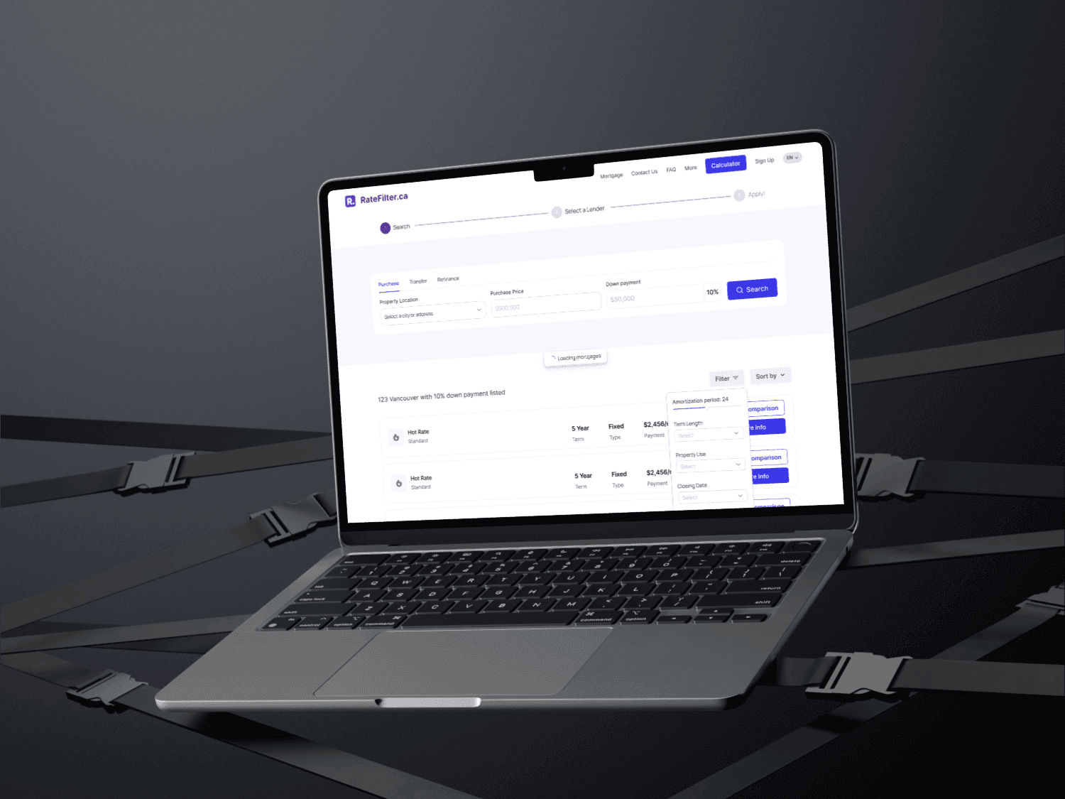
Redesigned the mortgage rate filtering experience to simplify loan comparison, reduce cognitive load, and help borrowers evaluate financing options with clarity.
01 · Context
Background & scope
Applying for a mortgage involves comparing numerous interdependent variables—interest rates, loan terms, APR, lender fees, and monthly payment structures. This case study examines the mortgage rate filtering and comparison journey, focusing on how information architecture and progressive disclosure reduce friction for borrowers.
02 · Challenge
Core problem to solve
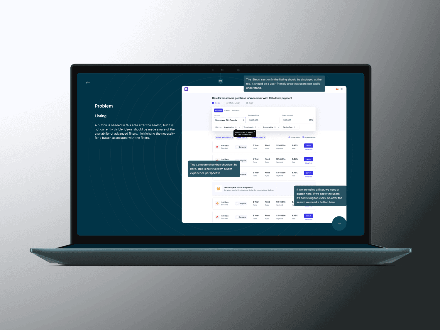
Mortgage platforms frequently expose every technical parameter at once, behaving like raw database queries rather than guided decision tools. When borrowers face dense financial terminology and crowded filter bars, cognitive load spikes and comparing two loan products side by side becomes unnecessarily difficult—especially on mobile screens.
03 · Objectives
What the design needed to achieve
- Simplify mortgage rate comparison across multiple loan variables
- Reduce cognitive load during initial filtering and rate exploration
- Improve filter usability with clearer grouping and progressive disclosure
- Support faster, more confident financial decision-making
- Remove mobile interaction bottlenecks on narrow viewports
04 · Key Findings
Findings from audit & discovery
Overly complex filter options
Exposing all secondary loan parameters simultaneously made it hard for users to know where to start.
Confusing financial terminology
Unexplained distinctions between interest rate, APR, points, and lender fees created hesitation.
Limited comparison visibility
Key differences between loan offers were buried inside dense rows rather than surfaced in scannable cards.
Poor prioritization of loan attributes
Primary decision drivers—monthly payment, rate type, and term—competed visually with secondary metadata.
Inefficient mobile experience
Multi-column filter controls and comparison tables did not adapt cleanly to mobile touch interactions.
05 · Design Decisions
How the interface was structured.
01 · Progressive filter disclosure
Surfaced primary intent controls first (loan purpose, term, rate type) while keeping advanced adjustments accessible without cluttering the initial view.
02 · Smarter grouping of financial criteria
Organized parameters around user mental models—monthly budget, upfront costs, and loan duration—rather than internal database fields.
03 · Clear rate comparison cards
Restructured rate results into scannable cards with consistent visual hierarchy for rate, APR, estimated monthly payment, and key fees.
04 · Plain-language explanations & mobile-ready controls
Replaced jargon-heavy labels with concise plain-language cues and touch-friendly filter drawers tailored for mobile borrowers.
06 · Screens & Flows
Selected interface views.


07 · Takeaways
Key product learnings
Filters should act like decision support, not database queries
Guiding users through high-impact choices first reduces abandonment and builds confidence before application.
Clarity builds financial trust
Transparent side-by-side rate cards and plain-language terminology matter more to borrowers than adding extra configuration toggles.
Why Mortgage Products Need Better UX, Not More Features
Mortgage applications are among the most complex digital journeys. Discover how UX design can simplify rate comparison, reduce cognitive load, and build trust throughout the home financing experience.
Continue Exploring